This assignment required that I read an article where I learned what makes a strong or weak icon. This article showcased 23 apps found on IOS. From those 23 I needed to pick 3 that I felt could be improved and then make those improvements myself. As well as an original design for an app I need to create myself.

|

|

The above icons are my redesigns:
The top left is a redesign of the headspace icon. I personally felt the current design was boring and plain, due to the fact that in only exhibited an orange circle. It didn't really seem to get the point of the app across which what an icon should do. My redesign includes a calm thought cloud, I tried my best to make the face design cohesive with the other mascots of the headspace app. I also altered the shape of the thought cloud to represent a brain slightly. The background colour is orange to keep with the colour scheme of the app as well.
The top left is my redesign for the Apple News App. I personally found the current design to be unclear and confusing, it exhibited a white background with pinkish purple shapes that I found out later was supposed to create the letter "N' for "News". I chose to redesign this icon in a way that reflects what the designers were trying to do but also adding my own style and flare. I usually avoid neutral colours in my work but I think the grey background added to the sleekness of the design. I incorporated the "N' and adding the apple logo into the design.
The bottom design was a redesign to a to-do list app. Almost every to-do list app looks the same, this app and its current design were no different. Coloured background and a check mark. Repetitive, boring, and no creativity points! It was hard to redesign this in a way that made the icon stand out but also got the point of the app across. I wanted to avoid the checkmark at all costs. So I opted for a list design with different symbols. I thought the star and the "X" would be eye catching. I also think the question mark does a good job at filling in negative space without taking away from the first two symbols. The background colours are inspired from the background of the current app just to add some cohesiveness.
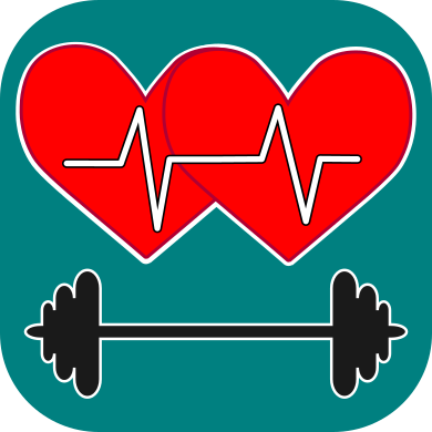
This design is for an app idea that I came up with called "Build & Connect". If a workout app where you and choose from thousands of different workout plans as well as find someone to do these workouts with. You are your workout buddy and build up your strength together and connect with each other while doing it. My design exhibits 2 heart with a pulse line travelling through them both to represent the connectivity of the app, and weight dumbbell to indicate fitness.
